Xtreme Chart Pro™ 2011 is
an advanced chart library for Windows environment software development. The
Chart Pro control brings the chart to virtually every development platform for
Windows. The Chart Pro controls are easy to understand and can be implemented in
only a few lines of code, but it also provides a rich set of classes for
customization and enhancement
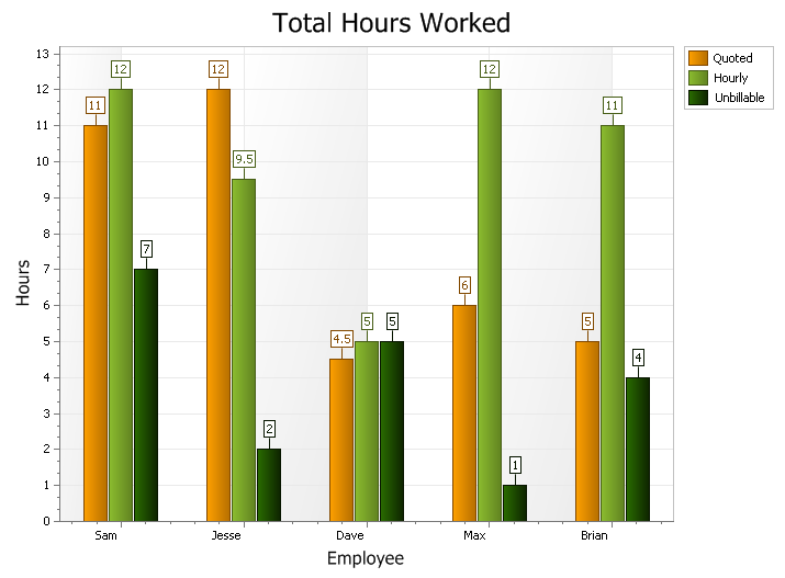
Standard Bar Chart
A bar chart displays data with rectangular "bars" with lengths relative to the
data they symbolize. Generally a bar chart is used to display discontinuous data
(data that has a discrete value), however it can also be used for continuous
data. Examples of discontinuous data would be "car color" or "tire size",
examples of continuous data would be "population" or "age".
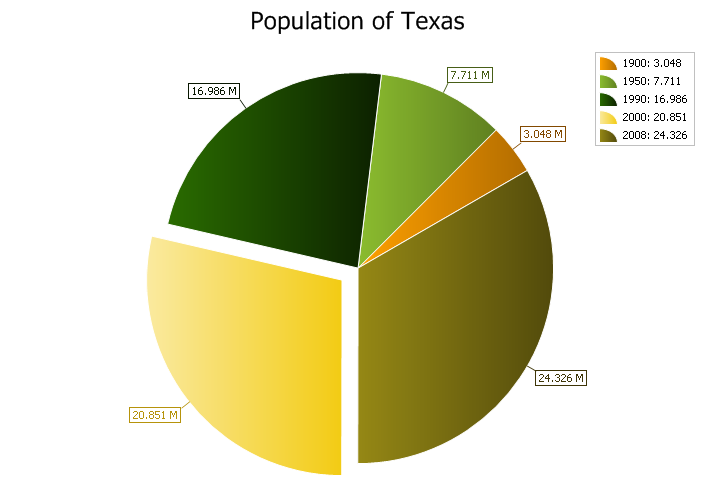
2D Pie Chart
A pie chart displays a series of data as "slices" of a "pie". The data in the
pie chart will be divided up into slices, each represents a percentage of the
pie. The size of the slice will be proportional to the data it represents and
each slice will be combined to represent some whole value.
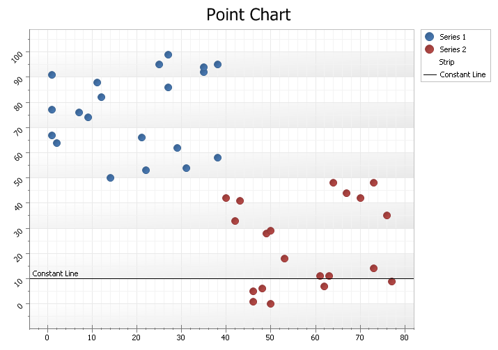
Standard Point Chart
A point chart displays data in a grid using Cartesian coordinates. Data is
displayed along the x and y axis, where x and y can represent any type of data.
A point chart is also referred to as a plot or scatter chart.
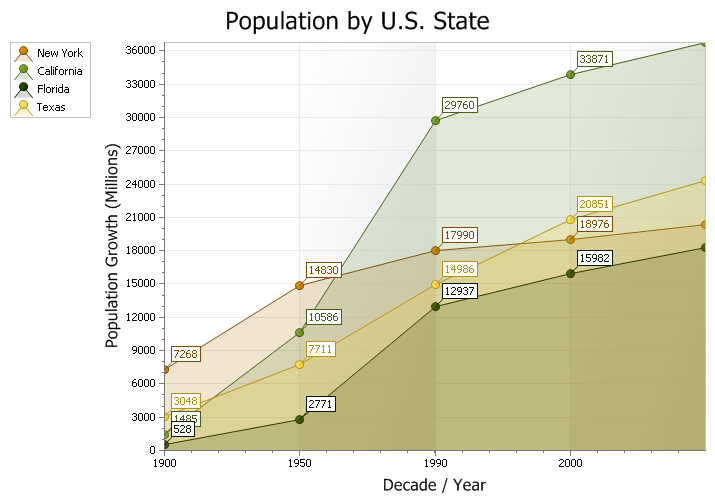
Standard Area Chart
An area chart is very similar to a line chart. Data is displayed using different
colors in the "area" below the line. Each series of points is represented with a
different color. Area charts are commonly used to display accumulated values
over a period of time.
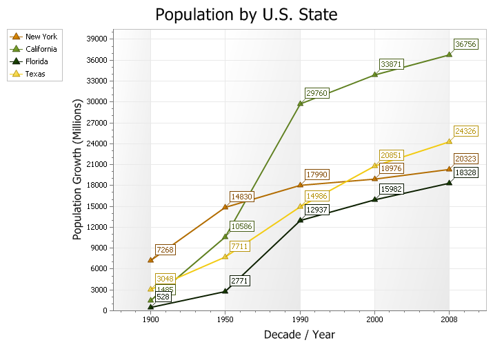
Line Chart
A line chart is is used to show a series of data points connected by straight
line segments. Charts of this type are generally used to illustrate trends in
data over a period of time.
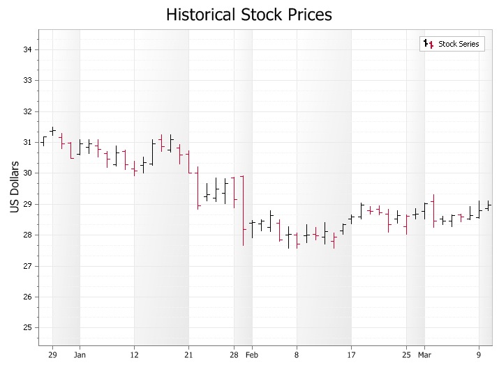
High Low Financial Chart
A High Low Financial Chart used to display trends for financial data, generally
stock market prices. A Stock\Bar chart is similar to a Candlestick chart, but is
considered harder to read for stock market analyse. The stock\bar chart displays
the high and low, open and close of data. Each "bar" represents the high, low,
open and close of data for a given value. The relationship between these bars is
important in determining trends among stock prices. The "open" and "close"
values are displayed as "tick" marks on the side of the bar, the "high" is the
tick mark on the right and the "low" is the tick mark on the left of the bar.
Buying pressure is indicated with black bars, where the close is greater than
the previous high. Selling pressure is indicated with red bars, where it's close
value is lower than the previous close value.
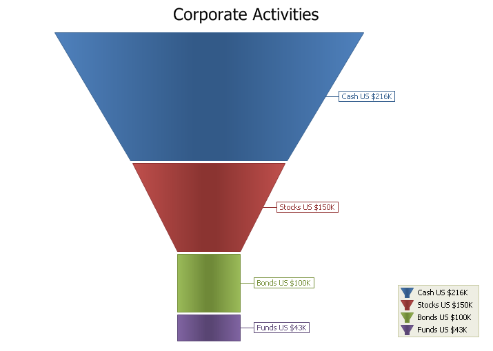
Funnel Chart
The Funnel chart displays a series of data in a funnel shape. The top portion of
the funnel will typically contain the largest percentage of the data, while the
bottom will "funnel" down to the smallest percentage, however the funnel will
allow data to be added in any combination to suit your needs. The size of the
funnel sections are all relative to each other and the order does not matter.
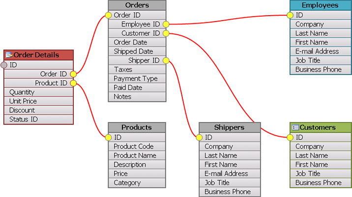
Flow Graph Control
The Flow Graph control is also included with the chart, which is a graphing
control used to display relationship graphs. This control can be thought of as a
tool to visually display the relationships for a relational database.
The control consists of "Nodes" that can be thought of as tables in a database.
The Nodes contain "connections" (fields of a table). The connections can have
many "connection points" that can be used to link the connections between
different nodes (i.e. linking an invoice table to a customer table via a
connection).
Nodes and connection lines can be dragged around the graph allowing the user to
fully customize the look of their relationship diagram.
The control also supports undo\redo edit operations in the case you allow the
nodes to be moved, renamed, connections added\removed, etc.
Several different zoom navigation functions allow the control to zoom to a
specific node, zoom to a range of nodes, zoom to selection and fit ti the
window.
Page transitions can be used to transition from one database to another.